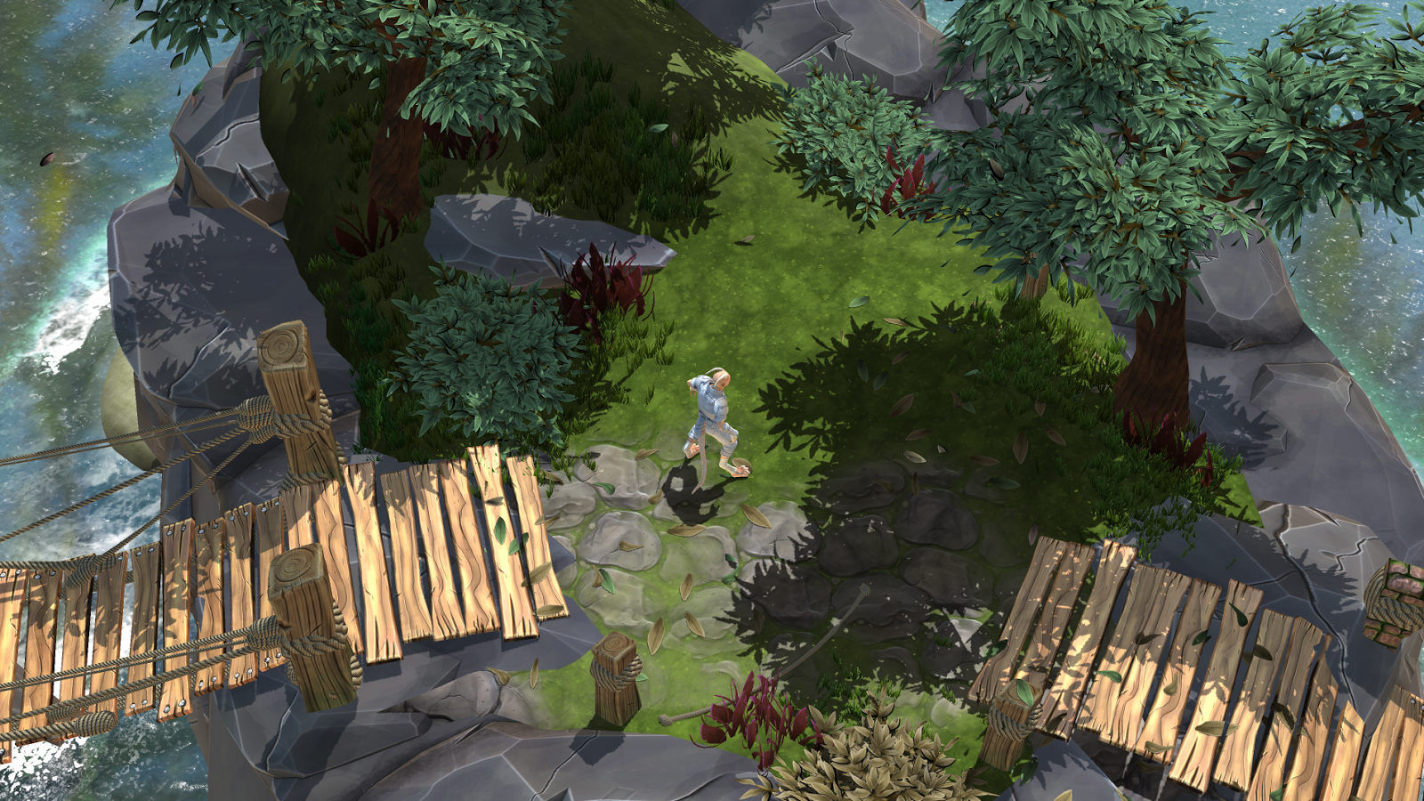
Didn't have time to upload a higher quality version. Will do this in the future
DavidH 3D
Character Modelling Work Dump
Thursday, 20 November 2014
Wednesday, 19 November 2014
World Building
Production of the level
Change from initial direction
Initially i was going to go for a more Bio shock Infinite style level in terms of art. however after thinking about it and having a look at a fair amount of games. I felt the most appropriate art style for me to try and achieve was somewhere between World of Warcraft and Bioshock. The Hand painted style of WoW Coupled with the graphical fidelity and resolutions present in Bioshock. Along these lines the focus of my level would switch thematically to be much more based in nature.
The new Look
This meant the new level would still be an art vignette however would focus on the production of nature based assets. Of course there needs to be some kind of architecture so I created a modular ruins set to be a base for the overgrowth. The architectural style of these ruins would be relatively indiscernible. but be a combination of stone and metal.
This Level will include doodads such as wooden crates, barrels, posts, and rocks.


Change from initial direction
Initially i was going to go for a more Bio shock Infinite style level in terms of art. however after thinking about it and having a look at a fair amount of games. I felt the most appropriate art style for me to try and achieve was somewhere between World of Warcraft and Bioshock. The Hand painted style of WoW Coupled with the graphical fidelity and resolutions present in Bioshock. Along these lines the focus of my level would switch thematically to be much more based in nature.
The new Look
This meant the new level would still be an art vignette however would focus on the production of nature based assets. Of course there needs to be some kind of architecture so I created a modular ruins set to be a base for the overgrowth. The architectural style of these ruins would be relatively indiscernible. but be a combination of stone and metal.
| Map of the new Level |
Texture Style
the texture style will be along the same lines as before. The normal maps baked out of zbrush will provide the basis for some moderate hand painting of textures. The process I undertook for each is outlined below.
| texture process for the new level direction. |
Some examples of this process in engine can be found below.
Each element on the crate here for example is created by using one tileable texture and adjusting the UV map in a way that it looks custom in terms of the edge wear for example.
Being relatively efficient.
One of the main goals here knowing that I was going to be creating a large amount of foliage was to be aware of how efficiently the game would run. Along these lines there are four key areas that helped this process.
Tiling textures.
Using and reusing tiling textures helped keep the number of individual texture maps to a minimum. This also made things much quicker to make as it involved less baking and more UV manipulation. The other upside to tiling textures is that the in game texture resolution is so much higher. However this does highlight the lacking texture resolution in objects next to it that don't employ tiling textures.
Example of the Textures in action below.
Pro Builder
Pro builder is the closest thing to BSP in Unity. For this reason when combined with a library of tiling textures it is extremely powerful. Pro builder UVs the mesh as it goes and combined with a grid system keeps everything clean.
Decals
Decals were extremely valuable in development of this level as they allowed me to break up the repetitiveness of the tiling textures. The main decal u created was fallen leaves as this meant i could re use my leaf asset and also make the scene seem as if it was a living place.
In Engine Tricks and Cheats.
the first of Two examples of tricks that I used to make my life easier was that I only really created one set of tree leaves and bush leaves. and Using these I changed the HUE on the shader and re-sized and replaced them in the prefabs to create a sense of variability in the level without having to do a huge amount of extra work, or tax the engine with more textures.
Another trick I used was to re-size and recolor the grass in the same fashion.
The final and most important thing i did in order to make the level come together efficiently was to create every asset with modularity in mind. this includes everything from the rope ties being able to be reused, to the ruins walls and trims all fitting together on a grid. this minimizes the assets and maximizes the possibilities.
Final Screenshots
Tuesday, 13 May 2014
Sunday, 13 April 2014
Sunday, 10 November 2013
Subscribe to:
Comments (Atom)


